
CarValue
CarValue
Overview
Our team was tasked with rebranding ADESA Market Guide as CarValue, a modern tool that provides wholesale dealers with accurate, real-time inventory valuations. The goal was to shift perceptions from outdated to tech-forward, while creating a visual identity that could stand independently from both Carvana and ADESA for future flexibility.
Client:
Carvana
Year:
2024
Role:
Visual Designer
Project Type:
BRANDING
STRATEGY
Overview
Our team was tasked with rebranding ADESA Market Guide as CarValue, a modern tool that provides wholesale dealers with accurate, real-time inventory valuations. The goal was to shift perceptions from outdated to tech-forward, while creating a visual identity that could stand independently from both Carvana and ADESA for future flexibility.
Client:
Carvana
Year:
2024
Role:
Visual Designer
Type:
BRANDING
STRATEGY
Overview
Our team was tasked with rebranding ADESA Market Guide as CarValue, a modern tool that provides wholesale dealers with accurate, real-time inventory valuations. The goal was to shift perceptions from outdated to tech-forward, while creating a visual identity that could stand independently from both Carvana and ADESA for future flexibility.
Client:
Carvana
Year:
2024
Role:
Visual Designer
Project Type:
BRANDING
STRATEGY
Process
I collaborated closely with another Visual Designer on this project, beginning with a series of stakeholder interviews to better understand the product and how the team envisioned its positioning. These conversations provided critical insights that helped us align on key brand attributes. From there, we developed a series of moodboards to explore visual directions rooted in those attributes, setting the foundation for our creative explorations.
I collaborated closely with another Visual Designer on this project, beginning with a series of stakeholder interviews to better understand the product and how the team envisioned its positioning. These conversations provided critical insights that helped us align on key brand attributes. From there, we developed a series of moodboards to explore visual directions rooted in those attributes, setting the foundation for our creative explorations.


Concept
The final direction, chosen by stakeholders, focused on a logomark that highlights the product’s initials to reinforce name recognition as part of the broader rebrand. We chose a clean, modern typeface and integrated a stylized “V” that doubles as a checkmark and an upward trend line, visually reflecting CarValue’s purpose of delivering accurate inventory valuation. The mark was crafted with sharp, precise cuts to convey a tech-forward, data-driven personality. It was also intentionally kept simple and scalable to ensure clarity and recognition across all sizes and UI placements.
The final direction, chosen by stakeholders, focused on a logomark that highlights the product’s initials to reinforce name recognition as part of the broader rebrand. We chose a clean, modern typeface and integrated a stylized “V” that doubles as a checkmark and an upward trend line, visually reflecting CarValue’s purpose of delivering accurate inventory valuation. The mark was crafted with sharp, precise cuts to convey a tech-forward, data-driven personality. It was also intentionally kept simple and scalable to ensure clarity and recognition across all sizes and UI placements.


Color Palette
To help CarValue stand out from other products, we introduced a new accent color, an electric mint green, to bring energy into the palette. The green adds visual excitement and also connects thematically to growth and money, reinforcing the product’s focus on valuation. We expanded the system by blending the greens and blues into a vibrant gradient, creating more flexibility for dynamic backgrounds.
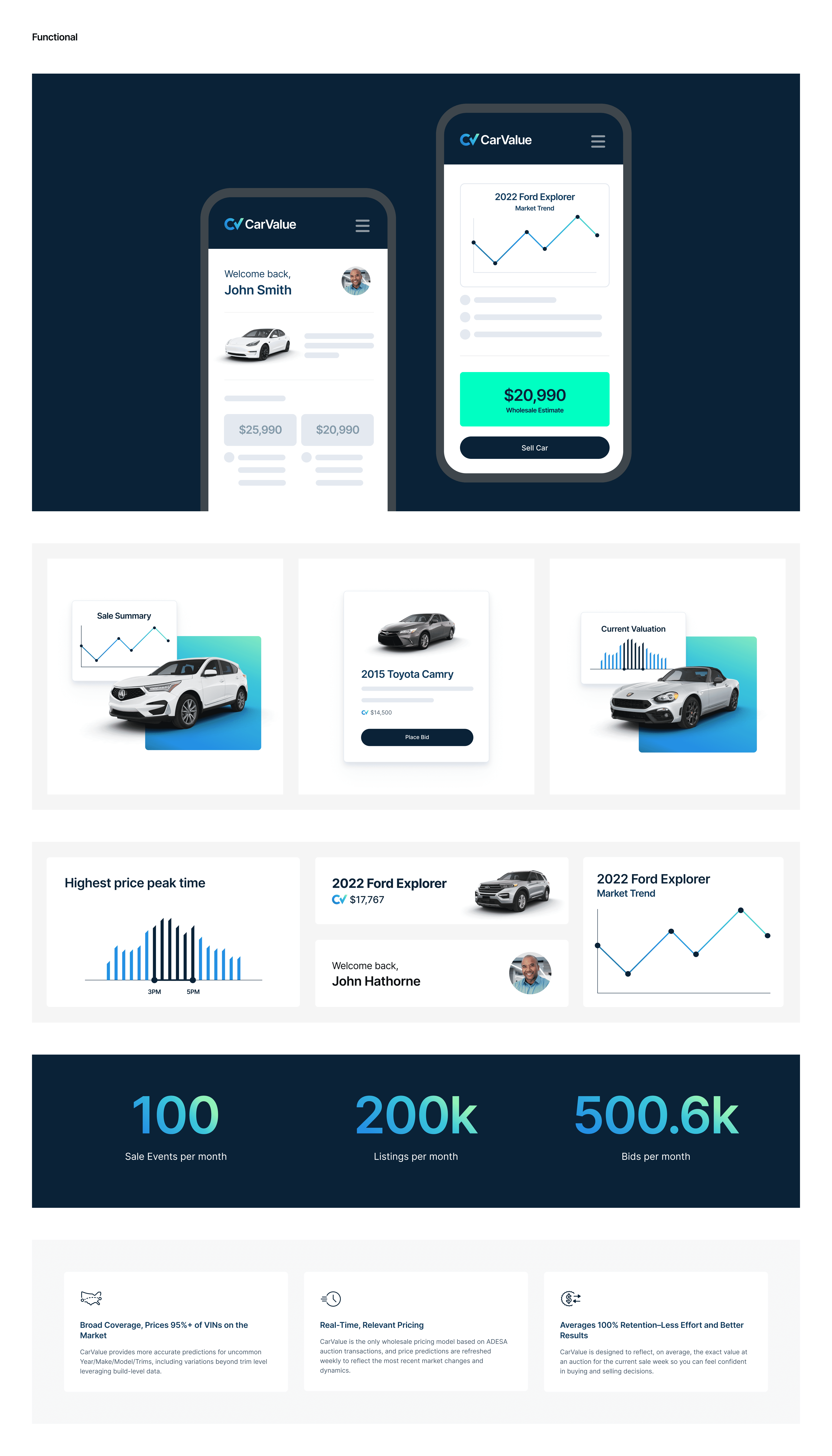
Style Sheet
We created a flexible style sheet to equip the product designer with primary and secondary visual treatments, curated photography, and modular UI elements. This allowed them to easily pull assets from the sheet and plug them directly into their wireframes as needed, ensuring consistency across the product experience.
We created a flexible style sheet to equip the product designer with primary and secondary visual treatments, curated photography, and modular UI elements. This allowed them to easily pull assets from the sheet and plug them directly into their wireframes as needed, ensuring consistency across the product experience.
Outcome
Despite a tight two-week turnaround, we successfully delivered a complete visual system and style guide that exceeded stakeholder expectations. The product team was highly enthusiastic about the final direction, and the engineering team has since implemented the new designs, with QA currently underway.